03 5264 7144
info@brownink.com.au
Menu
About
About Brown Ink
Our History
Meet our Team
How we Work
Who we Sponsor
Close
Services
Folio
Branding
Brand Identity
Logo Design
Websites
Packaged Websites
Custom Websites
Packaging
Food Packaging
Other Packaging
Advertising
Print Advertising
Digital Advertising
Other Work
Photography
Print Design
Digital/Video Projects
Misc.
Close
Website Packages
Professional Websites
Professional Website Package
Professional Website Gallery
Packages from $3,800
Premium Websites
Premium Website Package
Premium Website Gallery
Packages from $5,600
E-Commerce Websites
e-Commerce Website Package
e-Commerce Website Gallery
Packages from $5,600
Custom Websites
Custom Website Package
Custom Websites Gallery
Packages from $7,840
Close
Case Studies
Testimonials
Blog
Contact
Case Studies
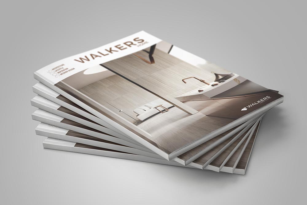
Walkers Case Study
Case Studies
Modcraft Case Study
Case Studies
Signature Homes Branding Case Study
Case Studies
Barwon Valley Smallgoods Case Study
Case Studies
Trevena Case Study
Case Studies
GORGE Chocolates Case Study
Case Studies
Applied Installations Case Study
Case Studies
Geelong Monitoring Services Case Study
Case Studies
C-Tech Case Study
Case Studies
Cafe Meals Case Study
Case Studies
Back to Basics Case Study
Case Studies
Start typing and press Enter to search


