03 5264 7144
info@brownink.com.au
Menu
About
About Brown Ink
Our History
Meet our Team
How we Work
Who we Sponsor
Close
Services
Folio
Branding
Brand Identity
Logo Design
Websites
Packaged Websites
Custom Websites
Packaging
Food Packaging
Other Packaging
Advertising
Print Advertising
Digital Advertising
Other Work
Photography
Print Design
Digital/Video Projects
Misc.
Close
Website Packages
Professional Websites
Professional Website Package
Professional Website Gallery
Packages from $3,800
Premium Websites
Premium Website Package
Premium Website Gallery
Packages from $5,600
E-Commerce Websites
e-Commerce Website Package
e-Commerce Website Gallery
Packages from $5,600
Custom Websites
Custom Website Package
Custom Websites Gallery
Packages from $7,840
Close
Case Studies
Testimonials
Blog
Contact
Brand Identity
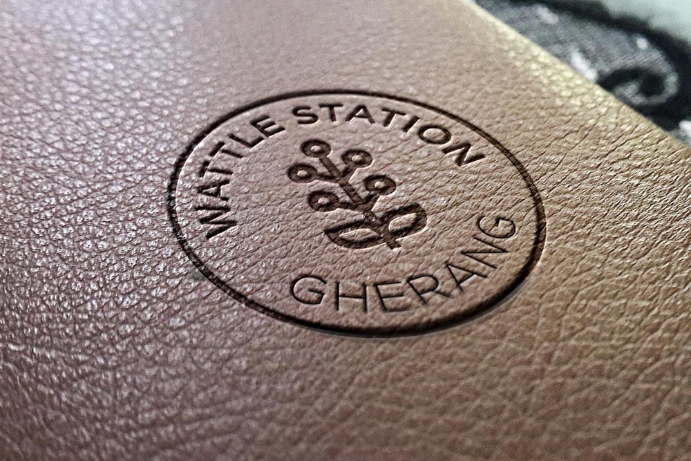
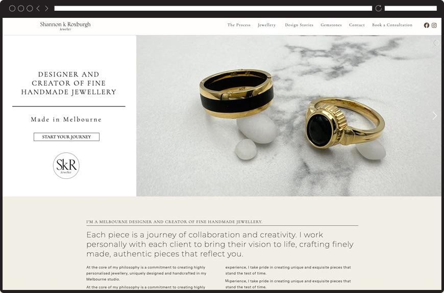
Wattle Station Branding
Branding
Morton+Co Architects Branding
Branding
,
Featured Home Page
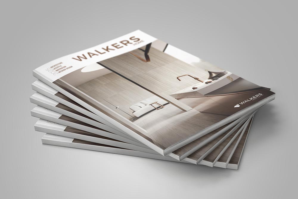
Walkers Branding
Branding
,
Featured Home Page
Titan Rail Branding
Branding
,
Featured Home Page
Turfology Branding
Branding
Shape Building Design
Branding
Custom Extracts
Branding
,
Featured Home Page
Warrior Ethos
Branding
Skin Screen Clinic
Branding
,
Featured Home Page
The Studio
Branding
Surfcoast Wellness Rooms
Branding
Prompt Documents
Branding
My French Obsession Branding
Branding
Firm and Free Branding
Branding
Mt Lewis Pizzeria
Branding
Casa Conveyancing Branding
Branding
Strike-a-Light Branding
Branding
Signature Homes Branding
Branding
Waikerie Ridge Almonds Branding
Branding
,
Featured Home Page
Chapman Building Group Branding
Branding
Mile Munchin Adventures Branding
Branding
,
Featured Home Page
Rearcon Branding
Branding
The Mattress Recycler Branding
Branding
Heritage Caravan Park Branding
Branding
Geelong Prestige Painting Branding
Branding
Solid Surface Group Branding
Branding
Clutter Free Home Branding
Branding
The World of Robotics Branding
Branding
Ballarat Honey Branding
Branding
,
Food Packaging
Polaris Lawyers Branding
Branding
Villarosa Real Estate Branding
Branding
Italian Provincial Tours
Branding
Interactive Hire Branding
Branding
Microkeeper Branding
Branding
Grainger Legal Branding
Branding
,
Featured Home Page
Healthy Minds Geelong Branding
Branding
,
Featured Home Page
Yanner Mann Dobson Law Branding
Branding
Spectrum Clarity Branding
Branding
,
Featured Home Page
Billy’s Bistro Branding
Branding
Carboni’s Pizza Kitchen
Branding
,
Featured Home Page
ReJenU
Branding
,
Other Packaging
C-Tech Branding
Branding
,
Featured Home Page
Trevena Branding
Branding
,
Featured Home Page
Brickworks Branding
Branding
ProAdvice Branding
Branding
Leaders in Life
Branding
,
Featured Home Page
Enga Coffee
Branding
GORGE Chocolates
Branding
,
Featured Home Page
Sproutwell Greenhouses
Branding
,
Featured Home Page
Geelong Monitoring Services
Branding
,
Featured Home Page
Kandu Services
Branding
Store & More
Branding
Blue Box Cool Rooms Branding
Branding
,
Featured Home Page
Aerovision
Branding
,
Featured Home Page
Villa Mercedes
Branding
,
Featured Home Page
Applied Installations
Branding
The Moto God
Branding
,
Featured Home Page
Cafe Meals
Branding
,
Featured Home Page
Desyco Constructions
Branding
Surfcoast Wholefoods
Branding
,
Featured Home Page
Revamp
Branding
,
Featured Home Page
Start typing and press Enter to search


